Innovia Natura’s new website was one of my favourite projects in 2025 – which is partly because the client was super, super nice, but also because I loved the challenges this project posed. 😉 The offering of this company is quite complicated, broad and layered, which meant we had to turn complexity into clarity to ensure customers get all the info they need without ending up confused or overwhelmed. Callenge accepted!
The Polish-Austrian company Innovia Natura produces natural cosmetic products and cleaning products for white label and private label customers in the B2B sector, currently targeting only German-speaking companies. And that sentence probably tells you everything you need to know about the challenges of this website project, right? 😅
- Innovia Natura is Polish, but they’re also Austrian.
- Innovia Natura produces natural cosmetic products, but they also produce cleaning products.
- Innovia Natura offers white label products, but they also develop unique products for their private label customers.
This means there were many different things we had to communicate without confusing customers or causing any doubt. Because the problem is: confused customers usually just leave your website, and customers who have doubts usually go to your competitors.
Why it is particularly important on websites to turn complexity into clarity
In this day and age, a website can have a number of different purposes, but usually people will visit your website at some stage during their customer journey with you – whether that’s to actually buy, to get more info on your products or services, to compare you to your competitor, or to find out about your brand’s values.
If you want to turn browsers into buyers, your online presence has to convince them that your company is a good choice for them. That’s crucial for any business, but particularly for those with a complex offering.
In the case of Innovia Natura, that meant that we had to reconcile various aspects of the company which didn’t necessarily go well together or maybe even feel contradictory. And that was in addition to finding a way to communicate the complex topics white label and private label in a simple, engaging way.
| The problem | The solution |
| Austrian customers might be prejudiced against Polish products and might not trust them as much. | To turn this potential negative into a positive, we focused on communicating that customers get the best of both worlds if they choose Innovia Natura: Austrian know-how paired with cost-efficient production in Silesia. |
| Very few of us will think about cleaning products when they hear natural cosmetics. And while this combination of product types might make sense from a business point of view, customers associate very different things with these two types of products, which might have a negative impact on trust. | We decided to separate the two types of products very clearly and give both of them an individual page on the website. |
| While white label and private label are concepts that go well together, they are rather complicated in nature and contain countless aspects including lots of legal stuff. | When presenting the white label and private label offerings on the website, we chose a direct comparison to show the most important differences between the two. It remains quite superficial on the website to avoid information overload in customers. |
One of our main goals for this website was to turn complexity to clarity to make the life of Innovia Natura’s customers easier. We decided to really simplify complex information, communicate in a way that’s easy to understand and avoid too many details.
The reason for this is that a complete presentation of the entire offering with all its facets wouldn’t have just been way too much for this website, it would also have provided zero benefit for the customers. It’s much more likely that a complete presentation of all facts would’ve overwhelmed potential customers.
And somebody who’s overwhelmed will never turn from an interested party into a customer. Neither will somebody who’s confused – or somebody who’s annoyed, for that matter. And all of these feelings can arise with information overload. 🙈
To avoid all of this and present Innovia Natura as a partner who supports their customers wherever they can, providing solutions rather than creating problems, the website gives a clear, easy to understand overview over what Innovia Natura can do for their customers.
Let’s have a look at how we achieved all of this on Innovia Natura’s website, shall we? 🙂
Examples: how this website simplifies complex ideas
One key aspect of presenting complex information in a way that’s easy to grasp is ensuring copy and design work together on your website. Unfortunately, it’s the norm in website projects that either the text or the web design are created first and then the designer or copywriter has to match the content to what’s already there. This is extremely frustrating, because it cripples what we can do.
Because the cool thing is that very often, a text challenge can be solved easily with a visual element and vice versa, and working on both parts of the website together allows for a really cool symbiosis of the copy and design. And only then can we really use all of your website’s potential – and simplify complex information. 😉
Innovia Nataura’s new website is living proof of web design and website copy enriching each other to achieve next-level clarity and elevating the entire online presence as a result. It really showcases what we can achieve when copy and design are created together, rather than in a vacuum.
Example #1 – the best of both worlds
To ensure customers understand that Innovia Natura’s fusion of Austria and Poland is an advantage for them, we put a rather strong focus on this topic and mention it frequently on the website. Some of our main arguments were:
- We keep mentioning Austrian know-how, which German-speaking customers tend to trust intrinsically.
- We frequently talk about cost-effective production in Poland, which has direct financial advantages for customers.
- We actively mention that many of the ingredients, particularly in the natural cosmetic products, are sourced from Innovia Natura’s own farms in Silesia. It was a conscious decision to use the German name of the Polish region.
- We frequently mention German-language support to build trust.
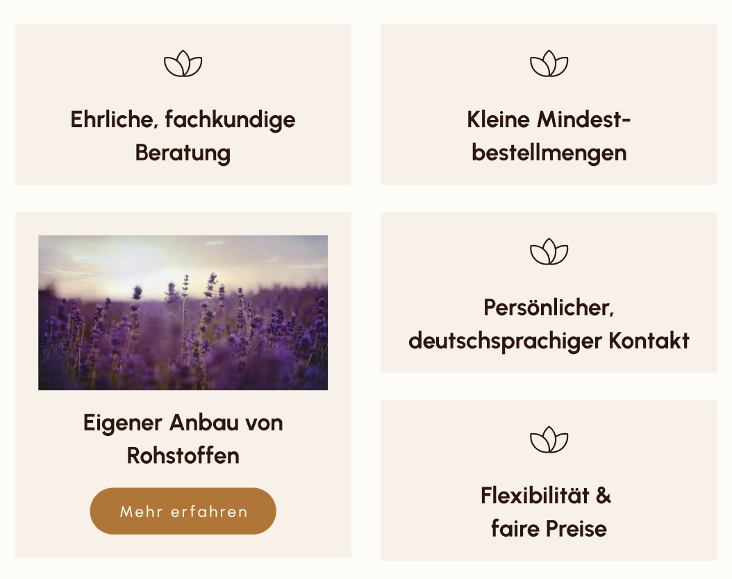
In this section, for example, which is part of the USP section on the about page of Innovia Natura, two of these arguments are mentioned: “sourced from our own farms” and “personal, German-speaking support” appear alongside “honesty and expert advice”, “small minimum order quantity”, and “flexibility & fair pricing”.
Innovia Natura is actually planning on strengthening trust even more by adding a new page to the website that specifically talks about how the ingredients from their own farms are grown, harvested, processed and used in products. This page is currently being developed and will soon go live.
So instead of letting customers wonder what “Polish-Austrian” means for them, Innovia Natura clearly says how this affects the customers and what the advantages are. This clarity avoids confusion and ensures doubt doesn’t even arise.
Example #2 – clear separation of the two product types
While it makes sense for Innovia Natura to offer both, natural cosmetic products as well as cleaning products, this combination is likely to confuse customers. These two types of products are associated with very different, and sometimes even conflicting things, so for most people, it’s quite hard to reconcile them in our heads.
And that’s exactly why we decided to clearly separate the two whenever possible (or necessary).
For example: on the home page and the about page, we mostly talk about both types of products – which works because most services are available for both, the natural cosmetic products and the cleaning products, and Innovia Natura offers white label and private label solutions for both of them.
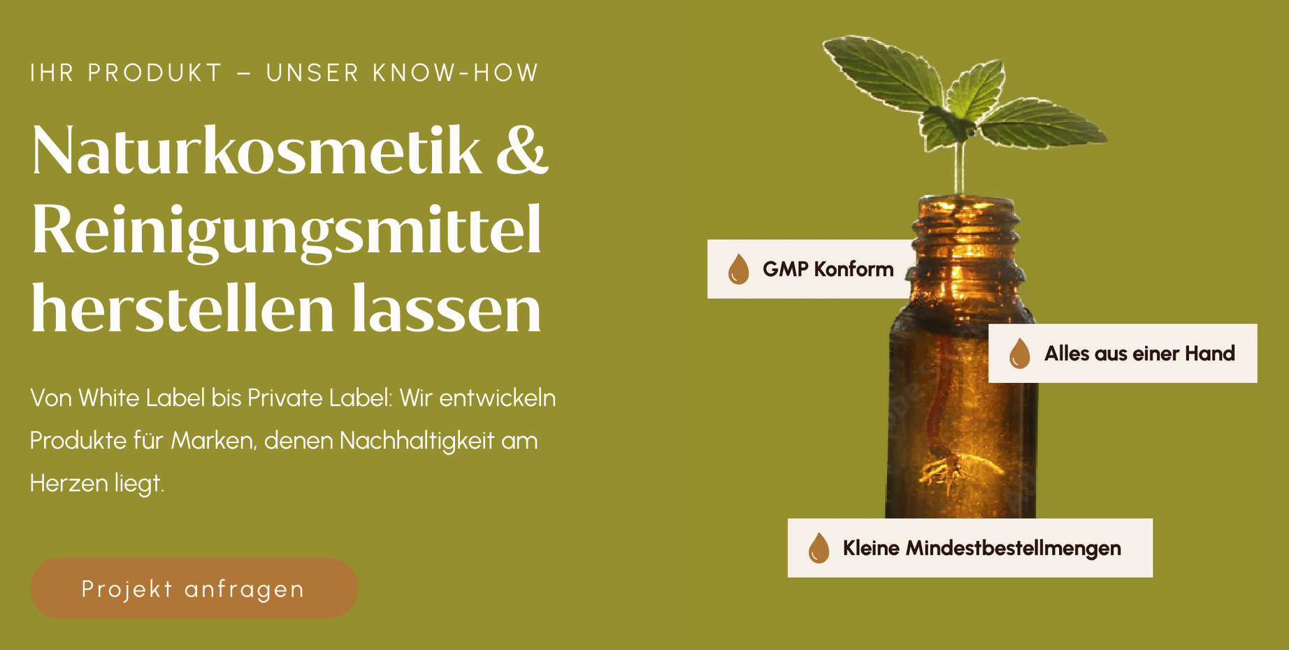
So, at the very start of the home page, we focused on saying that Innovia Natura produces products for B2B customers – whether that’s natural cosmetics or cleaning products doesn’t really matter at this stage.
We position the company as a partner you can trust, mentioning know-how, sustainability and a few other USPs.
Right after the hero, however, the separation starts and website visitors are invited to choose whether they want to know more about natural cosmetic or cleaning products. When they do, they are directed to either of the two individual offer pages, which have a completely different focus.
The hero on the page for natural cosmetic products shows this shift: instead of positioning Innovia Natura as a partner, we highlight the topics of natural cosmetic products, white label, and private label.
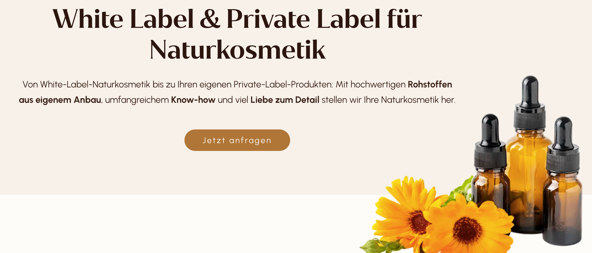
What’s also worth mentioning here is how we say things in the body copy: It was a conscious choice to use topics and wordings that are very common in the world of natural cosmetics. We talk about high-quality ingredients sourced from Innovia Natura’s own farms and say that everything is produced with love and attention to detail.
Now, let’s look at the page for cleaning products: To allow for a better comparison of the two types of products, design and the H1 follow the same style we’ve already seen. Here, too, we opted for clarity instead of creativity (which often means complexity) to show customers that Innovia Natura makes their lives easier, not harder.
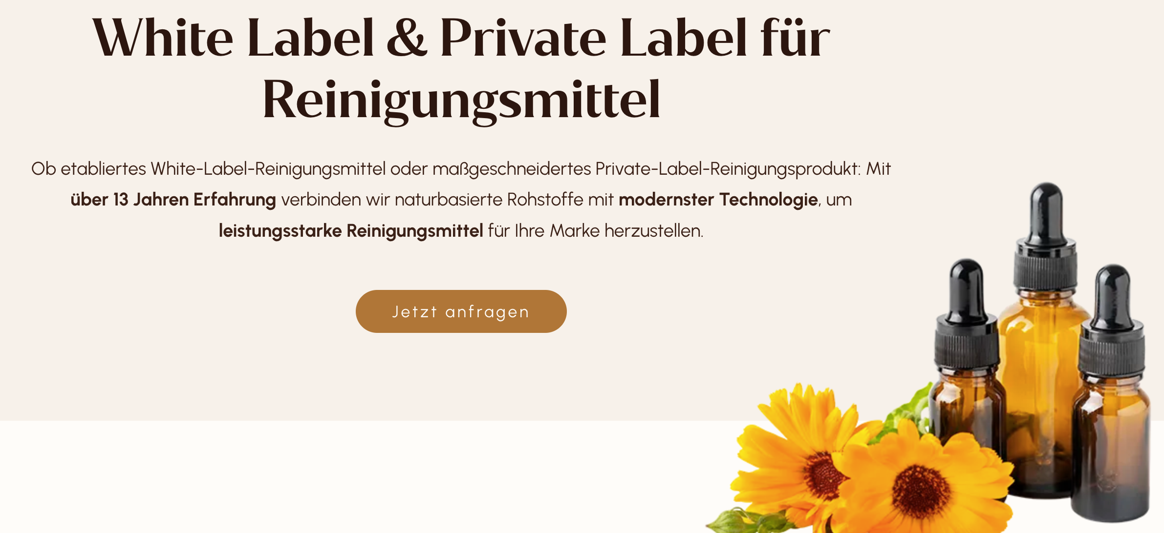
As with the other product page, we focus on the topics of cleaning products, white label, and private label instead of all of Innvoia Natura’s USPs.
A look at the body copy clearly shows some of the intrinsic differences between the two product categories: here, we talk about effective cleaning products, modern technology and Innovia Natura’s experience in the sector.
In the world of cleaning products – even if they use nature-based ingredients – other topics are simply way more important than the emotional arguments we needed with natural cosmetics. 😅
Example #3 – comparison of white label & private label
It was a conscious choice to only give an overview over white label and private label and what each of these offers mean. It’s a bird’s-eye view, if you will, that allows us to turn the topic’s complexity into clarity.
This isn’t always possible, but made sense for Innovia Natura for two reasons: On the one hand, it’s safe to assume that customers who look for white and private label specifically already have a general idea of what they are. On the other hand, if that isn’t the case, we wanted to ensure that we don’t confuse people at this early stage of their customer journey.
Because the thing is: even if you don’t know about the difference between white and private label, the info we provide on the website is enough to give you a general understanding of the two – and if you’re interested in either of the two offers, you’ll get all the info you need in a meeting and/or Innovia Natura’s product catalogue.
Apart from simplifying complex information, this allows for creativity in the copy – and that, we always love! 🥳
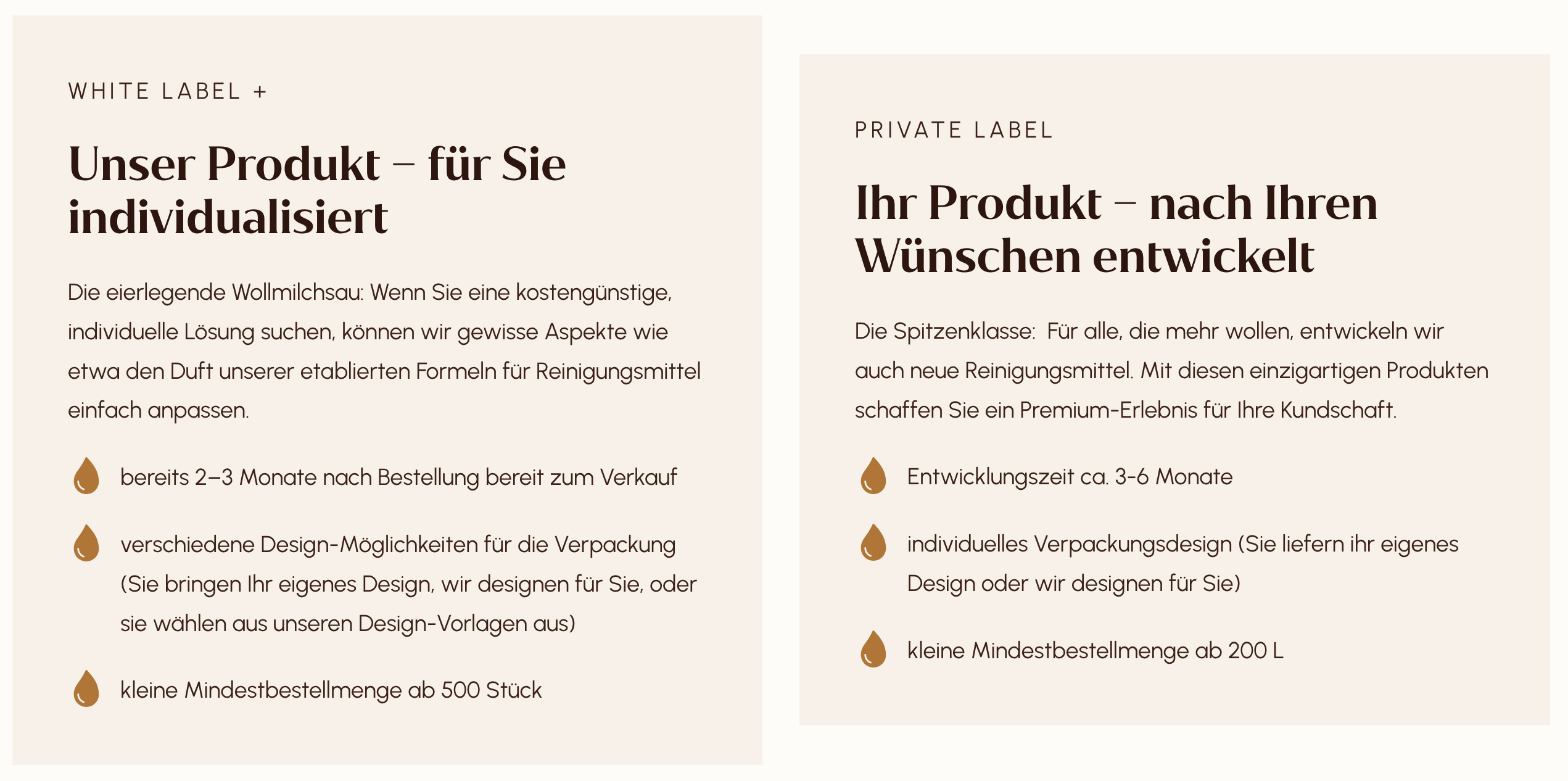
As a trade-off for the details and hard facts we don’t need here, the texts got lots of personality and create images in the reader’s head:
For white label, we talk about the all-singing, all-dancing solution that’s individual but also cost-effective and mentions established cleaning products (read: products you can trust 🙂). For private label, we say it’s top of the class – unique products that are only yours and allow you to create a premium experience for your customers.
And by means of comparison, the headings say white label is “our product – personalised for you”, whereas private label is “your product – created according to your requirements”. We also compare how long it takes to ship the products, design options and minimum order size.
The cool thing about this side-by-side view is that it puts all the information into context without us actually having to spell it out, which helps to paint a very clear picture.
Customers need clarity
Something too many companies forget is that customers need clarity for their purchase decision. That might be secondary in the low-cost sector, but becomes an absolute necessity once you pass a certain price threshold – and where that threshold is, is very personal,
That’s exactly why, as the owner of a website, you should always do whatever you can to communicate your offer as clearly as possible and answer any questions before they arise.
And in my humble opinion, we did a great job at achieving that for Innovia Natura – and since they are actually contacted regularly via their website, customers seem to agree. 😉